Typography is spoken language rendered visible and static (if on paper) or transformable (if on screen). Type choice is a tool that can help communicate the tone & style of a brand and create hierarchy. Effective type choice can make text more readable. Typography is a visual tool.
Examples:
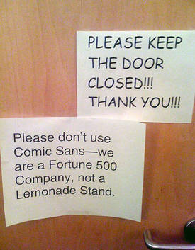
 Typography is important for instilling emotions around a given service – a law office whose letterhead is written in Comic Sans would not instill as much confidence as one written in Georgia. Similarly, a handwritten sign for a hospital would not inspire as much confidence as a one typed out in an imposing serif.
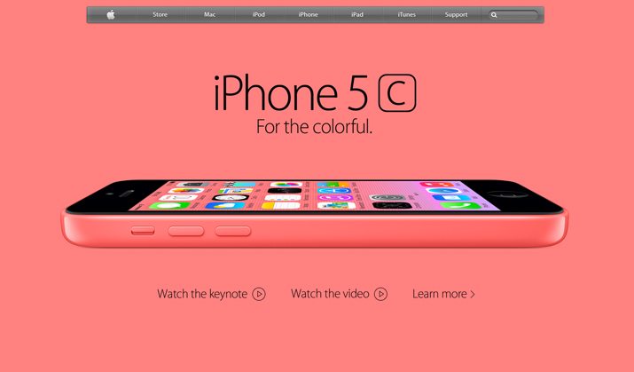
- An interface may use a combination of types to make hierarchical distinctions like a san serif font for headings and serif font for body copy.
Analysis
Informational
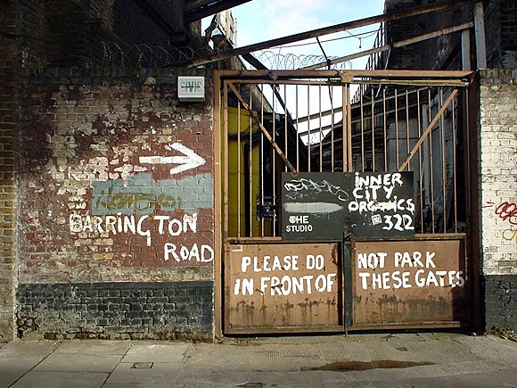
Type is used to convey information (such as direction) to the user who reads it.
Orientational
Type can instruct people what to enter within a given field (as shown here), or where a particular link leads. Employed in different sizes and weights, it can also indicate various pieces of information’s importance.
Feedback
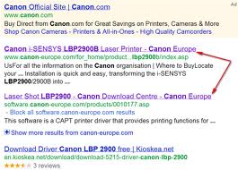
Once clicked upon, type in links often changes colors to indicate that users have already accessed the content on the “other side” of the link.


Symbolic
In Western cultures, serifed type often connotes elements of grandeur, status, and tradition, while sans-serifs can indicate a concept is more novel, minimal, and playful.
Performative
Type underlined and/or in blue indicates that it is clickable, while black text does not.


Recent Conversations