Color is a visual cue in design can be used to create hierarchy, mood, and continuity.
In interaction design, it can also mark importance, provide feedback, and provide directional cues.
Examples:
- In the United States, importance or required information might be marked in the color red
- Buttons might change color to provide feedback on what’s clickable, when a cursor is hovered over the button, when the button is pressed, when a button is clicked, and when a button (or, more often, a link) has been visited
- Color might provide a pathway to a preferred action, like having the call-to-action action being a colored button
- Color might also be used to separate information: Having text in boxes of color to distinguish one type of information from another, like sidebars.
Symbolic
It is common knowledge that colors convey symbolic meaning for in different cultures around the world. For instance, in Western cultures black is worn ceremoniously to funerals, while in many Asian cultures white is usually worn. The repeated use of these colors creates connotations for colors. Additionally there have been many studies on the psychology of colors.
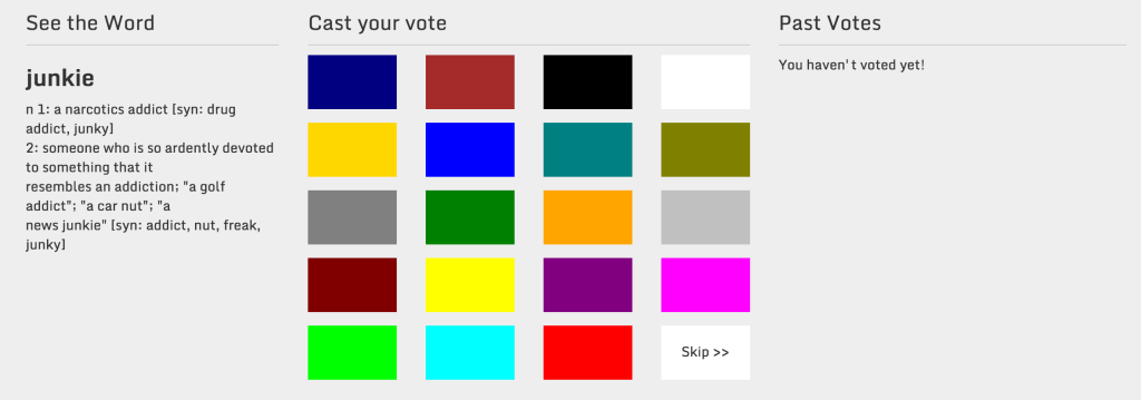
The cymbolism project builds off of the idea that there are shared cultural associations for words by asking in visitors to indicate which colors they most associate with a word:

Screenshot from the Cymbolism project.
Color in cultures infographic:
image: “Boutet 1708 color circles” by C. B. (probably Claude Boutet) – Traité de la peinture en mignature (The Hague, 1708), reproduced in The Creation of Color in Eighteenth-Century Europe. Licensed under Public Domain via Wikimedia Commons – http://commons.wikimedia.org/wiki/File:Boutet_1708_color_circles.jpg#mediaviewer/File:Boutet_1708_color_circles.jpg

Recent Conversations