Scale is the size of an element in relation to other elements.
Examples:
- The first level of hierarchy in text (heading 1) is usually larger in size to mark the beginning and its importance in describing all the other elements.
- A button that takes up more space compared to the others might be considered to be more important or the interface’s call-to-action. Likewise, you might make something like a caption or less important photo smaller so it doesn’t distract a viewer.
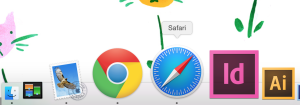
- Mac dock icons scale on roll over to mimic magnification, indicate roll-over, and make it easier to click

Orientational:
Increasing the amount of space is one to to show importance or to draw attention to otherwise distinguish it. This is typically used with weight, order, and color.
Stylistic:
Scale can also be used stylistically. For instance, when a text is blown up into a large size it can become a more graphic, visual element rather than a purely functional one.
Questions:
How might sound scale?
Recent Conversations